



redesign
redesign
redesign


Adopt, don't shop!
Adopt, don't shop!
Adopt, don't shop!
about
about
The Znajdki Foundation is a compassionate nonprofit organization committed to the welfare and well-being of animals. Through their efforts, they provide vital resources such as shelter, medical care, and adoption services to homeless and neglected pets.
The Znajdki Foundation is a compassionate nonprofit organization committed to the welfare and well-being of animals. Through their efforts, they provide vital resources such as shelter, medical care, and adoption services to homeless and neglected pets.
The problem
The problem
In the recent years, the world has been going through a revolutionary shift, as more and more aspects of our lives are moving online. Animal organizations are no exception. People build their trust in such organizations through their online image. I have discovered that Znajdki foundation has a rather outdated and not intuitive website. Through that they are not receiving as much financial support as they could and less animals are finding their forever homes.
In the recent years, the world has been going through a revolutionary shift, as more and more aspects of our lives are moving online. Animal organizations are no exception. People build their trust in such organizations through their online image. I have discovered that Znajdki foundation has a rather outdated and not intuitive website. Through that they are not receiving as much financial support as they could and less animals are finding their forever homes.
The challenge
The challenge
The project’s primary goal is to secure more financial support for Znajdki Foundation to provide better care for the animals in need. It also aims to increase the number of pet adoptions. To achieve that, I had to design a user-friendly website to serve as a central hub for information. Users should be able to easily browse through adoptable pets and make online donations effortlessly. Social media engagement plays a crucial role, as the foundation strives to reach a wider audience and encourage more followers to become volunteers, as they are an integral part of Znjadki’s mission.
The project’s primary goal is to secure more financial support for Znajdki Foundation to provide better care for the animals in need. It also aims to increase the number of pet adoptions. To achieve that, I had to design a user-friendly website to serve as a central hub for information. Users should be able to easily browse through adoptable pets and make online donations effortlessly. Social media engagement plays a crucial role, as the foundation strives to reach a wider audience and encourage more followers to become volunteers, as they are an integral part of Znjadki’s mission.
The Design
The Design
The Design
The main page
The main page
The main page
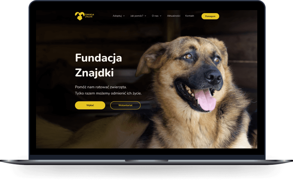
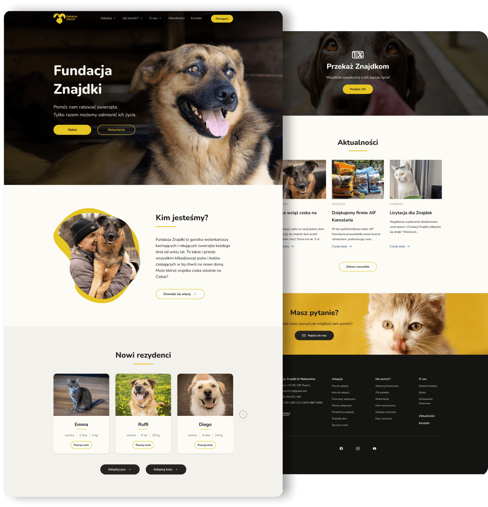
The first impression plays a crucial role in how people build their relationship with the product. It’s very quick and based on the limited information they get when they land on a website. That’s why it is important to address the main goal of the foundation, which is to increase financial support. A strong but short headline, two CTAs with action-oriented words, heartwarming hero image - all serve to increase the conversion rates of the website.
The first impression plays a crucial role in how people build their relationship with the product. It’s very quick and based on the limited information they get when they land on a website. That’s why it is important to address the main goal of the foundation, which is to increase financial support. A strong but short headline, two CTAs with action-oriented words, heartwarming hero image - all serve to increase the conversion rates of the website.


The financial support
The financial support
The financial support
As one of the core goals of the foundation, the need for financial support is strongly conveyed throughout the website. From users’ interviews, I’ve learned that they value transparency and that it is important to state where the money they share with Znajdki goes to. They can read what exactly is paid for with donations. The donation form is short and easy to fill out. The suggested amounts of money are stated, however, users can choose whatever amount they want to share. There are also links to external websites, through which users can help Znajdki as well.
As one of the core goals of the foundation, the need for financial support is strongly conveyed throughout the website. From users’ interviews, I’ve learned that they value transparency and that it is important to state where the money they share with Znajdki goes to. They can read what exactly is paid for with donations. The donation form is short and easy to fill out. The suggested amounts of money are stated, however, users can choose whatever amount they want to share. There are also links to external websites, through which users can help Znajdki as well.


The pet base
The pet base
The pet base
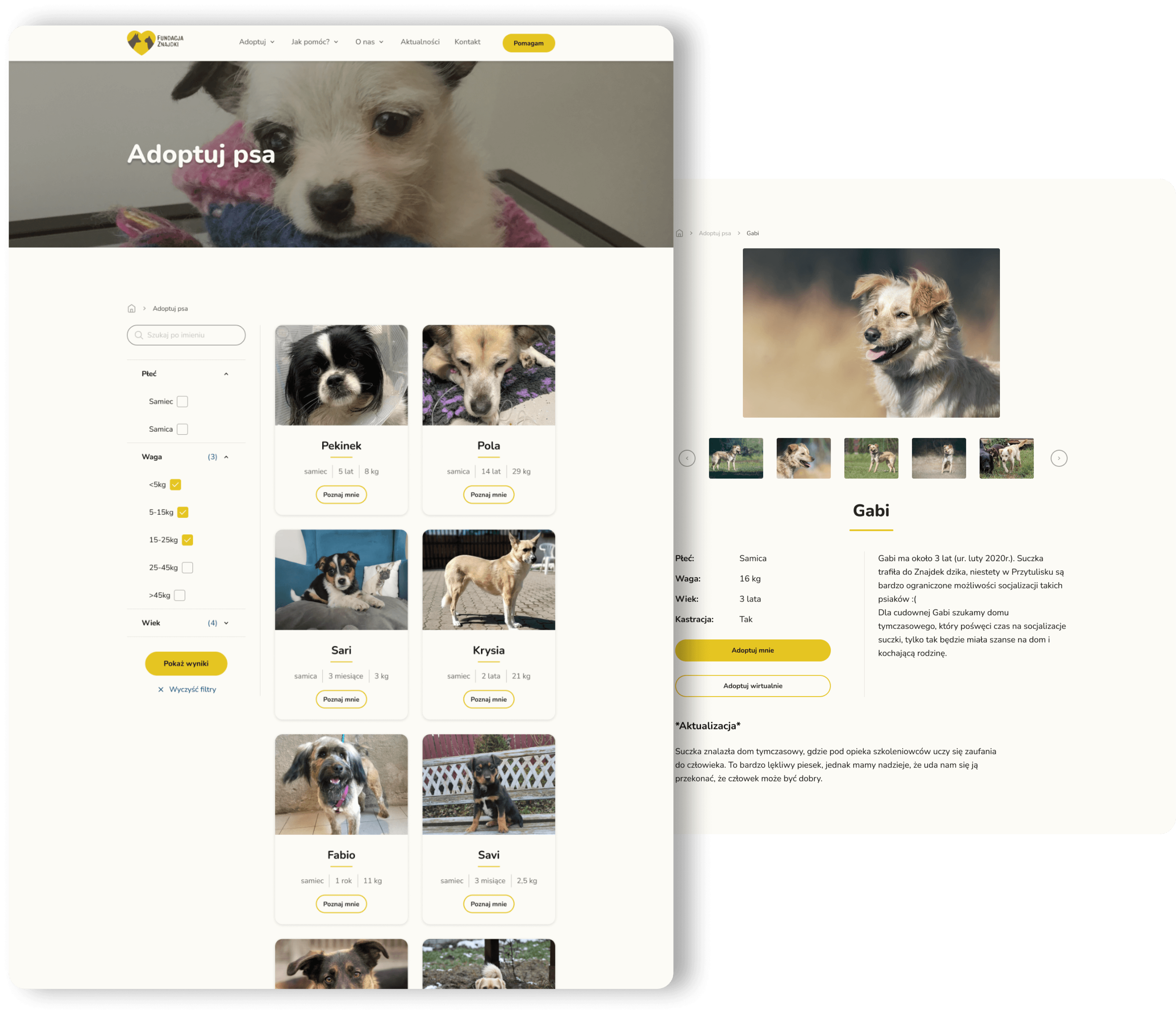
Interviews I’ve conducted, told me that all the users would start their adoption process online. Thus, it is important to provide them with a smooth and intuitive experience. Users might have specific needs and preferences in their potential rescue pet. The original Znajdki’s web design lacks the filter options and users have to scroll through the whole base of animals to find the one they want. This might be tiring and discouraging. I’ve designed the simple filters bar to ensure a better and faster adoption flow for users.
Interviews I’ve conducted, told me that all the users would start their adoption process online. Thus, it is important to provide them with a smooth and intuitive experience. Users might have specific needs and preferences in their potential rescue pet. The original Znajdki’s web design lacks the filter options and users have to scroll through the whole base of animals to find the one they want. This might be tiring and discouraging. I’ve designed the simple filters bar to ensure a better and faster adoption flow for users.


The informational pages
The informational pages
The informational pages
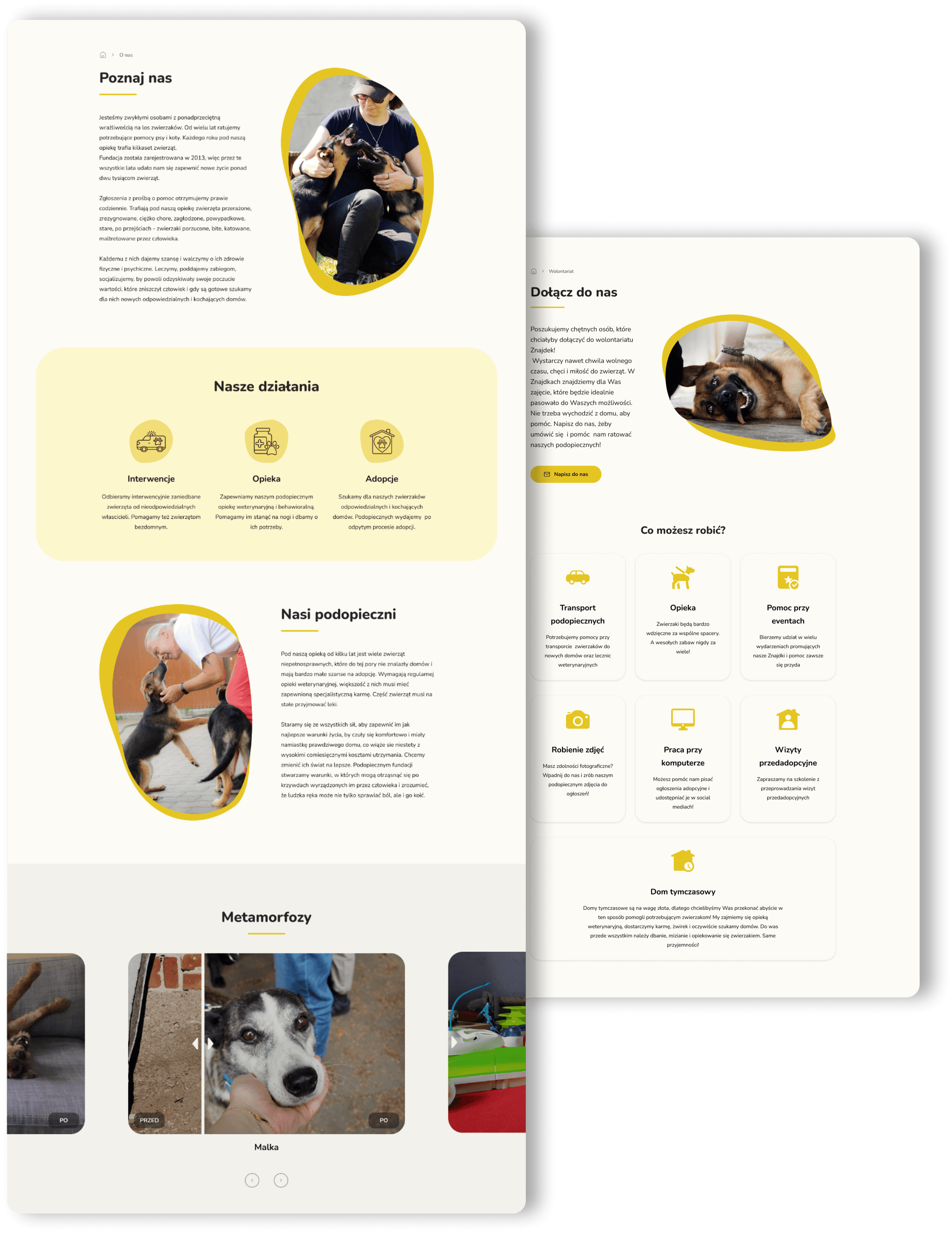
“What makes you trust a foundation? How do you decide who to help?” These are questions I’ve asked the users. The answer was that the foundation needs to be active, share reliable information, must not be anonymous. People trust organizations more when they see real faces behind them. I’ve created “About us” section to show users the story of people working at Znajdki. The design is friendly, playful, with organic shaped photos.
Another important factor in users’ decision-making process is actually knowing what they can do (other than just donate money). The second view shows a page for potential volunteers. Cards with icons and short descriptions are straightforward and easy to scan for users.


Other pages
Other pages
Other pages
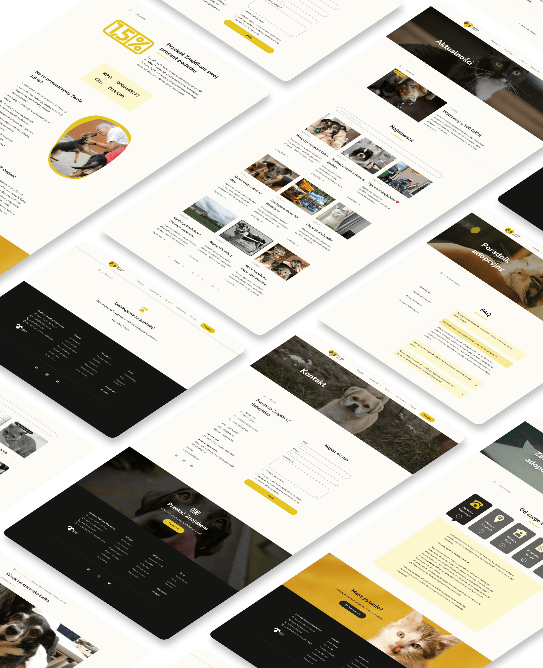
The whole design is pleasant and friendly, so users will feel good when they enter the page. They should be encouraged to help, adopt and ultimately come back. To provide a sense of familiarity for both the users and Znajdki’s members, I decided to go with the same primary color (#E5C522) as the original logo. Throughout the design there are a lot of photographs of pets from Znajdki. This is intentional, as people love looking at the cute and innocent pictures of animals. The internet is drowning in such images, and yet it still works magic. Organic shapes, rounded buttons and a rounded font, they all welcome the users with enjoyment and ease.
The whole design is pleasant and friendly, so users will feel good when they enter the page. They should be encouraged to help, adopt and ultimately come back. To provide a sense of familiarity for both the users and Znajdki’s members, I decided to go with the same primary color (#E5C522) as the original logo. Throughout the design there are a lot of photographs of pets from Znajdki. This is intentional, as people love looking at the cute and innocent pictures of animals. The internet is drowning in such images, and yet it still works magic. Organic shapes, rounded buttons and a rounded font, they all welcome the users with enjoyment and ease.
Responsive design
Responsive design
Responsive design
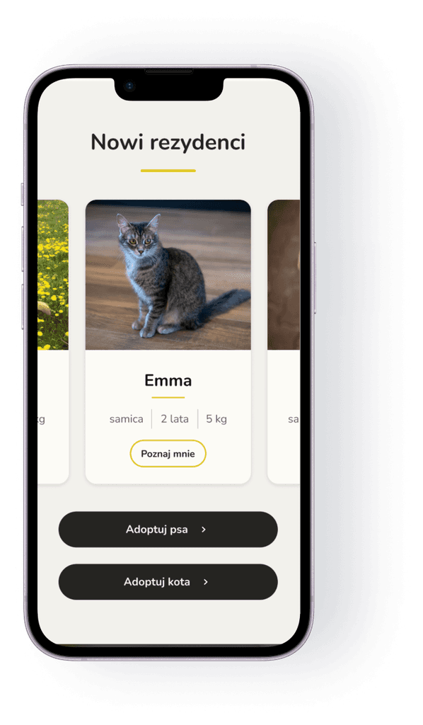
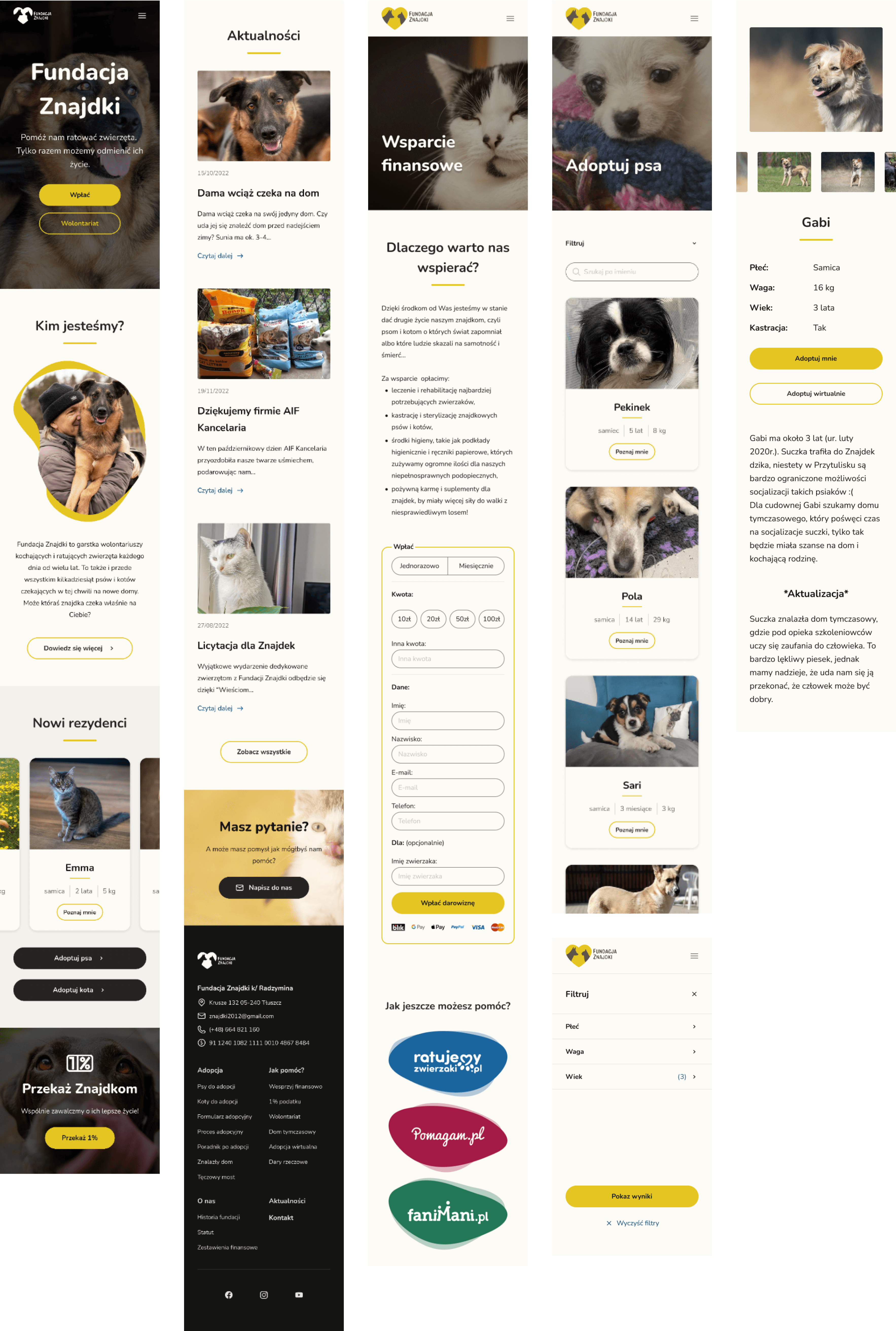
To ensure the best possible experience for users, I’ve made sure that the design is responsive across devices. To achieve the main goals of the project, the website has to reach a broader audience, which leads to more engagement with the product. That’s why the possibility of interacting with the website on any screen size is essential.
To ensure the best possible experience for users, I’ve made sure that the design is responsive across devices. To achieve the main goals of the project, the website has to reach a broader audience, which leads to more engagement with the product. That’s why the possibility of interacting with the website on any screen size is essential.


Behind The Scenes
Behind The Scenes
Behind The Scenes
Before the redesign
Before the redesign
Before the redesign
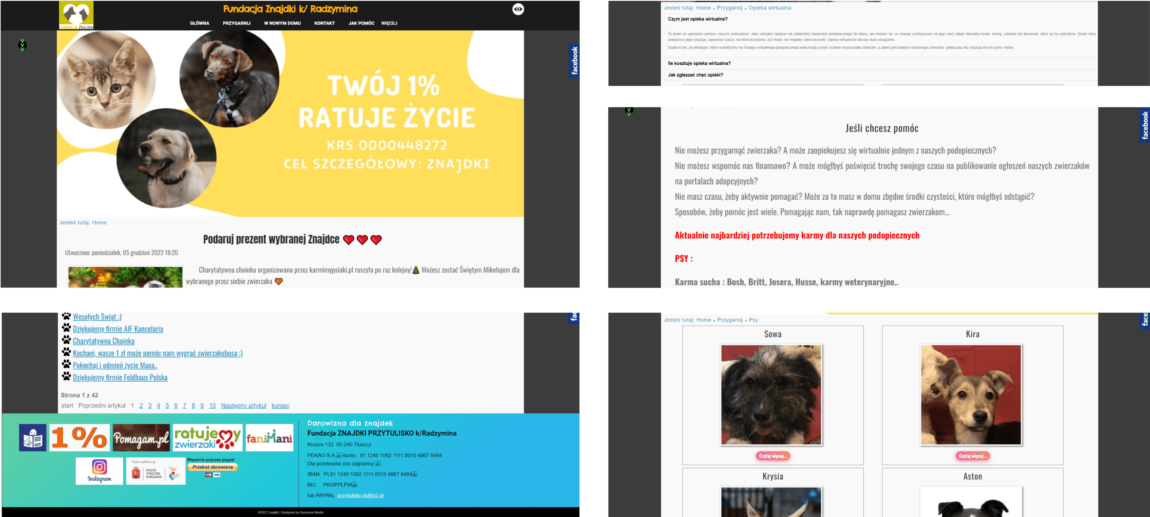
The original website looks outdated. The donation button is nowhere to be seen. The fonts differ across pages. There is no consistent color scheme. The about section is hidden so deep that I have only found it through googling the phrase “Znajdki about us”. The general feeling of the website does not inspire trust and for a non-profit organization users’ trust in essential for the foundation’s future well-being.
The original website looks outdated. The donation button is nowhere to be seen. The fonts differ across pages. There is no consistent color scheme. The about section is hidden so deep that I have only found it through googling the phrase “Znajdki about us”. The general feeling of the website does not inspire trust and for a non-profit organization users’ trust in essential for the foundation’s future well-being.


Competitive Analysis
Competitive Analysis
Competitive Analysis
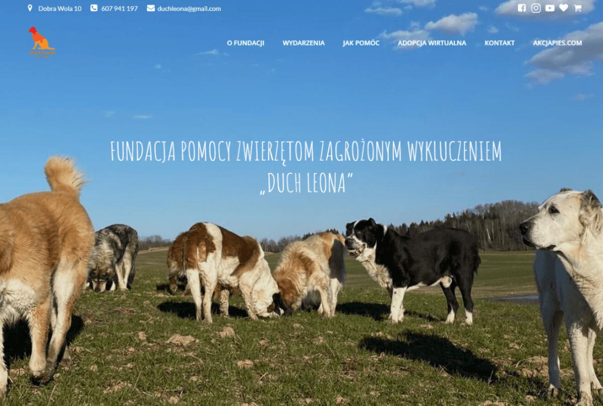
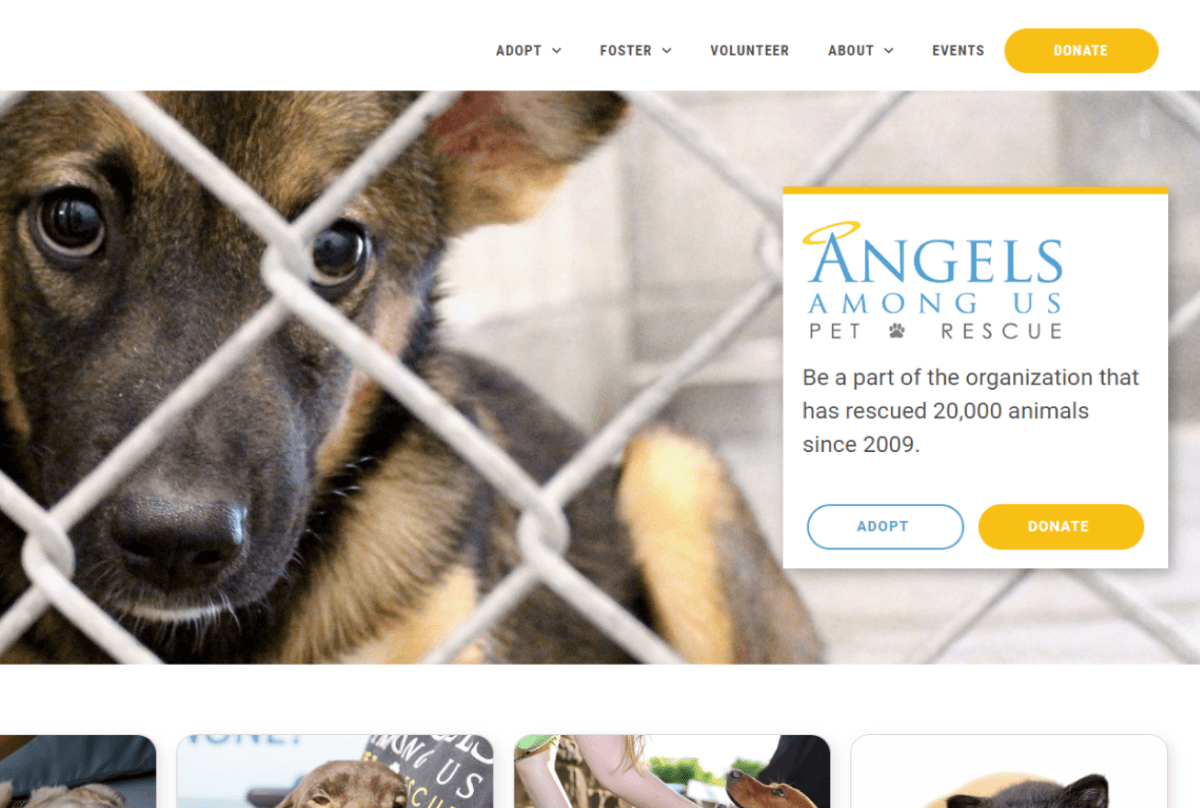
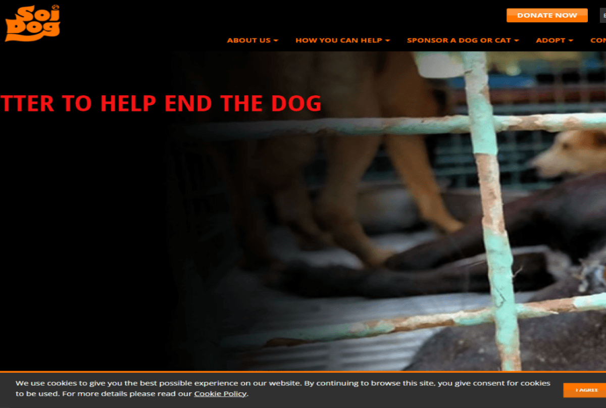
I have looked into four websites of both Polish and foreign pet foundations to assess what are their strengths and weaknesses. I’ve found that most of the websites offer the same basic, but essential, options. The feature that is most emphasized on those websites is a DONATE button. It is usually placed in the main navigation, so it requires almost no time to get into the donation process. Another section of great importance is the About section. All the foundations I’ve checked strive to be as transparent as possible, giving a lot of information about them, from the story how they started to financial reports. Through that, they become more trustworthy.
Half of the websites lacked a pet catalog, making it difficult for people to find their potential pets.
And none of the websites had any kind of guide for new adoption families.
DIOZ


Duch Leona


Angels Among Us


Soi Dog


User research
User research
User research
I’ve conducted interviews with potential users to gain valuable insights and feedback. I wanted to learn about their experiences with pet organizations and what they thought could be enhanced. It allowed me to conduct thorough UX research and identify areas for improvement.
I asked questions regarding three different aspects of interacting with a non-profit organization’s website. First, I inquired about helping pet organizations. I wanted to learn what determines who they decide to help, what makes a foundation trustworthy and how they prefer to donate money. It turned out that interviewers donate their money if they know how it is invested. All of the subjects answered that they’d like to pay via BLIK. They also need a clear indication of what goods are needed. Additionally, they care if the foundation is actively helping animals.
Further, I asked about how they would start their adoption process. They unanimously answered that they would first look for a pet online. To make this process easier, they’d need filtering options on a website to browse only through pets they could be interested in adopting.
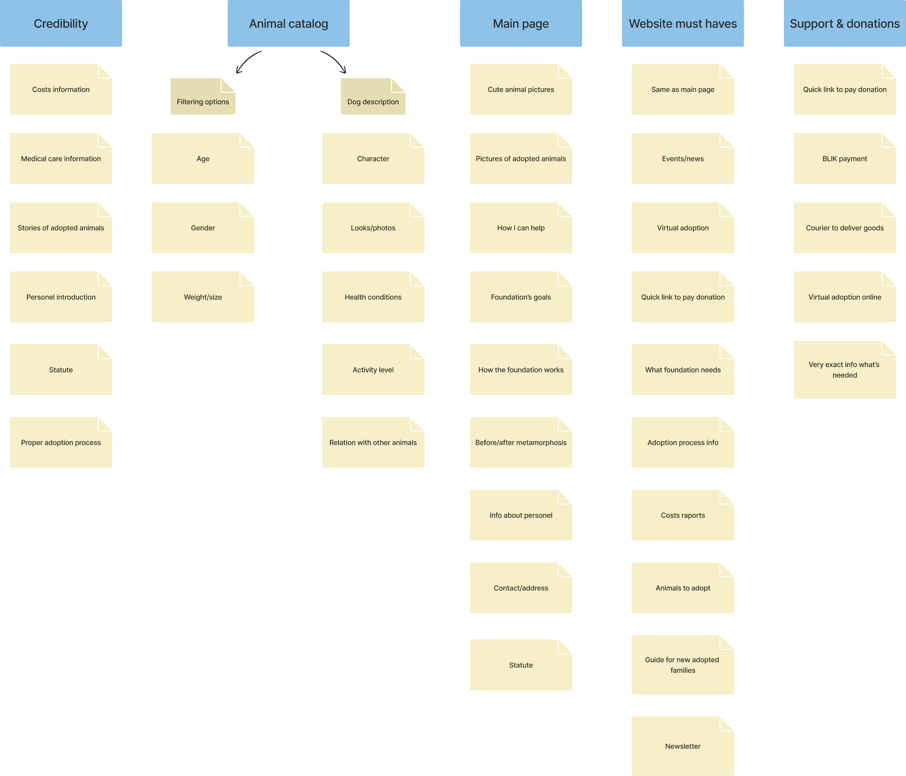
Last but not least, I inquired about the desired architectural structure of such a website. The results are shown in the below affinity diagram.


User personas
User personas
User personas
Based on the results of the interviews, I‘ve created two personas- a woman in her twenties, who is interested in adopting a dog, and a businesswoman, in her forties, who is too busy to get a pet, but willing to support pet organizations financially. By creating empathy maps for both personas, I attempted to understand their motivations, feelings, pain points and potential actions.
Based on the results of the interviews, I‘ve created two personas- a woman in her twenties, who is interested in adopting a dog, and a businesswoman, in her forties, who is too busy to get a pet, but willing to support pet organizations financially. By creating empathy maps for both personas, I attempted to understand their motivations, feelings, pain points and potential actions.


Journey Map
Journey Map
Journey Map
The customer journey map I created provides a comprehensive visualization of the user experience, mapping out the various touchpoints, emotions, and interactions users go through while engaging with the website. It helped me see the user’s perspective.
The customer journey map I created provides a comprehensive visualization of the user experience, mapping out the various touchpoints, emotions, and interactions users go through while engaging with the website. It helped me see the user’s perspective.


Wireframes
Wireframes


The Prototype
The Prototype
The Prototype